

PeterPanettone
-
Content Count
1354 -
Joined
-
Last visited
-
Days Won
5
Posts posted by PeterPanettone
-
-
I've tried it now with a fresh new WinWord document where I pasted the clipboard content. No squares there.
Then I retried it with the document where the squares have appeared yesterday. The squares appeared again.
So I have to conclude that the problem appears only in a specific WinWord document.
I could not find out why.
-
Thank you! It works.
I wonder whether the documentation is intentionally misleading there.
-
In Delphi, I have configured the IDE to automatically load the previous project at startup.
Is there an IDE Command Line Switch to DEACTIVATE the auto-loading of the previous project?
I have looked here but did not find any:
http://docwiki.embarcadero.com/RADStudio/Rio/en/IDE_Command_Line_Switches_and_Options
-
2 hours ago, dummzeuch said:I guess you mean the squares on the left hand border? (You should have said so, because i just starred at this picture for several minutes before i noticed them.) Everything else looks fine to me.
Yes. What are the squares doing there?
-
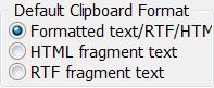
Configuration is: Formatted text/RTF/HTM:
After pasting in WinWord 2010 it looks like this:
-
19 minutes ago, Rollo62 said:Do you really need that feature still to avoid out-of-memory ?
No, I often get projects where this option is set to True.
-
16 minutes ago, Stefan Glienke said:Experience has told me to not get too excited yet 😉
I also always try to avoid Πρόωρη εκσπερμάτωση.

-
 2
2
-
-
12 minutes ago, Stefan Glienke said:Maybe with the reworked tooling based on LSP in 10.4 it will work.
That would be like Christmas, Easter and birthday together.
-
1
-
-
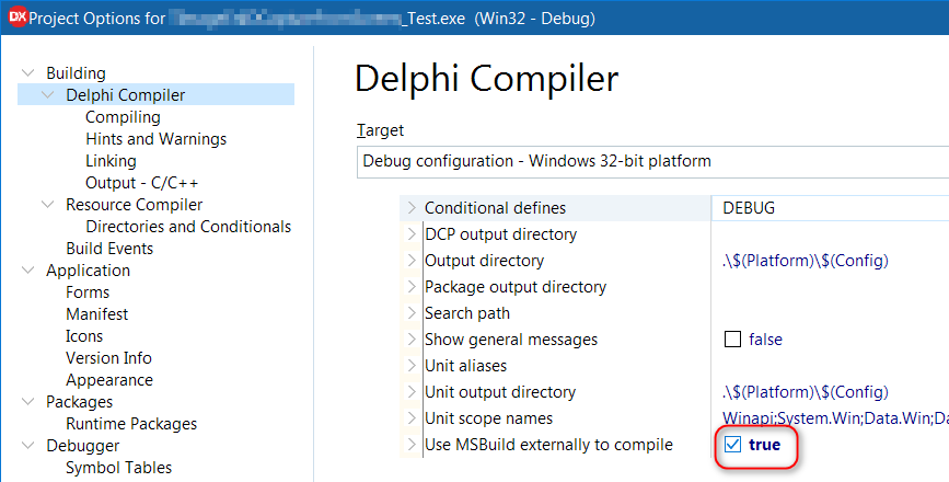
When I create a new VCL Application from scratch in the Delphi 10.3.1 IDE with File -> New -> Windows VCL Application then everything including CODE INSIGHT works well.

This newly created VCL Application project has the "Use MSBuild externally to compile" project option set to FALSE as default:
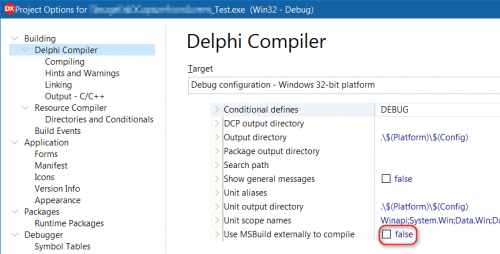
But when I set the "Use MSBuild externally to compile" project option manually to TRUE:
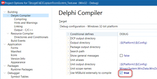
...(and then rebuild the project) then CODE INSIGHT does not work anymore: This affects the Code Insight popup menu which normally is invoked after typing a DOT:
...and so the Code Insight popup menu does not show up anymore!
Question: Is this a BUG in the IDE?
-
Until now I achieved what I wanted to achieve by intercepting the right-button-mouse-click on the title-bar of any application window. But now I have a system program which also does exactly that, so it overrides my action.
-
Is there a way to add a system-menu item to all applications? (Not just only to my own application).
-
44 minutes ago, dummzeuch said:It's a veritable mess.
Thank's for the clarification. I sometimes feel the smell of Atari in the Delphi IDE, or am I wrong?
-
Very good idea!
Is it possible to export/import all Tools entries at once or only one by one?
-
And please note that the SUBJECT of this conversation is "...code-completion popup..."
-
On 5/31/2019 at 8:15 AM, dummzeuch said:... it's still considered shouting, ...
Come on, we don't live at Atari times anymore.
-
Just now, Stefan Glienke said:Writing entire words in uppercase (even more so if colored red) is considered shouting on the internet
I often write in uppercase without having the intention to shout.
-
7 minutes ago, Stefan Glienke said:That was my point - no need to shout.
Nobody is shouting. We talk about source code documentation here.
-
However, the CnWizards Code Input Helper seems to have options to show source code documentation:
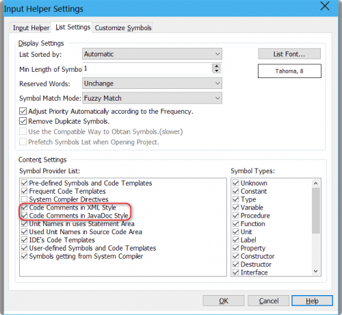
But I don't see any source code documentation in the CnWizards Code Input Helper, although there IS documentation in the source code where I am testing this.
-
1 hour ago, Stefan Glienke said:What should it show?
scnr 😉
Where did you get this? Marco Cantù answered at the Quality Portal:
"RAD Studio IDE offers Help Insight, which can grab XMLDoc documentation from the source and displays is alongside in a very similar way. The limitation is we don't have large coverage in terms of XMLDoc."Stefan, maybe you confuse something here. We are talking about SOURCE CODE DOCUMENTATION.
-
Also, look at how other IDEs show the documentation in the code completion popup:
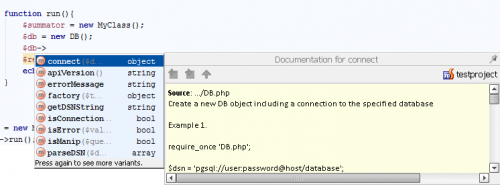
Why the Delphi code completion popup does not show the documentation in the code completion popup?
Is there a Delphi IDE add-in which displays the documentation in the code completion popup like in the above screenshot?
-
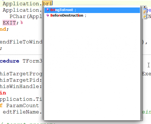
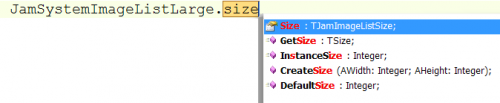
I am using the CnWizards version of "Intellisense" (code-completion) as it has several advantages with respect to the native Delphi code-completion (see the screenshot). However, both code-completion popups lack the ability to show whether a selected property is published or public:
Or is there a distinction which I do not see?
-
15 hours ago, pyscripter said:- Andreas Hausladen. Obones and and a few others have been quite active in maintaining JCL/JVCL.
- Although, there are no recent releases the recommended installation procedure involves using the GitHub master. See https://github.com/project-jedi/jcl for details.
- JCL/JVCL support all Delphi versions including the most recent ones.
- There have been tens of commits fixing warnings and minors bugs over the last few months (https://github.com/project-jedi/jcl/commits/master)
- There are masses of gems in both JCL and JVCL that are still worth using in production code.
Embarcadero should hire them and pay them a decent salary!
Embarcadero should also hire a few dozens of first-class Delphi developers and maintain the major open source Delphi libraries!
What is Embarcadero doing with the many billions of $$$ they get from Delphi licenses?
-
8 minutes ago, dummzeuch said:I'm afraid recursive hardlinks word result in an infinite loop right now.
Who would be so stupid to create recursive hardlinks? (I am not sure whether Windows allows to create recursive hardlinks at all?)
And What does this have necessarily to do with Grep Search?
-
2 hours ago, Sherlock said:I hope nobody builds infinite loops that way...
It would be very easy to detect recursive links and (implicitly) visited files/links/dirs...
Another approach would be using hardlinks. Would work with current search.
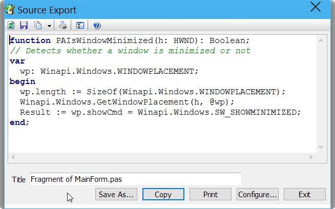


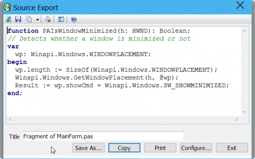
GExperts SourceExport problem
in GExperts
Posted · Edited by PeterPanettone
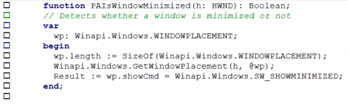
I have analyzed what GExperts exports as HTML clipboard format:
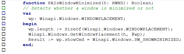
This is what CnWizards exports as HTML format:
BTW, the fragment exported by CNWizards does not create the squares in the faulty WinWord document.